
Mask-Image is used to layer one image (with a transparent section) on top of another so that only the portion beneath the transparent window is visible. This can also be done with gradients.
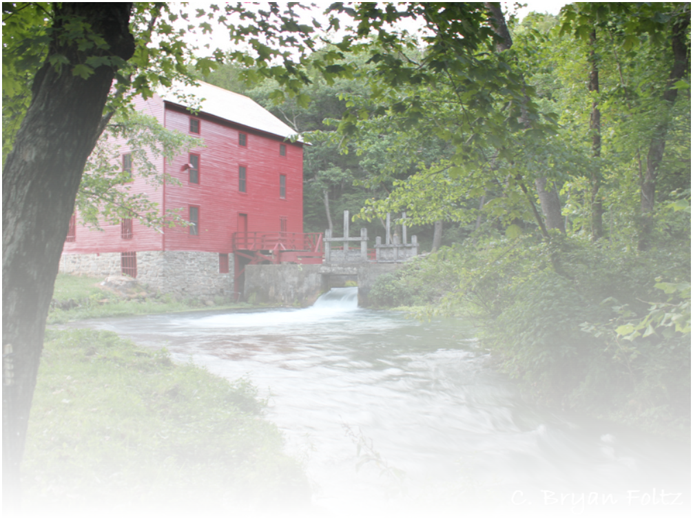
Although intriguing, note the requirement to use muliple images. One possible use would be to create transparent letters with an image showing through (of course this can be done in most graphics packages).
Note that gradients absolutely require the use of vendor prefixes.
HTML
<img src="alleyspring1_s.jpg" class="ex3">
CSS
.ex3 {
-webkit-mask-image: -webkit-gradient(linear, left top, left bottom, from(rgba(0, 0, 0, 1.0)), to(transparent));
-webkit-mask-image: linear-gradient(rgba(0, 0, 0, 1.0), transparent);
mask-image: -webkit-gradient(linear, left top, left bottom, from(rgba(0, 0, 0, 1.0)), to(transparent));
mask-image: linear-gradient(rgba(0, 0, 0, 1.0), transparent);