
A quick search of the web will yield numerous articles demonstrating common layouts created with just a little CSS Grid.
Rather than replicating those, let's consider just a few possible options.
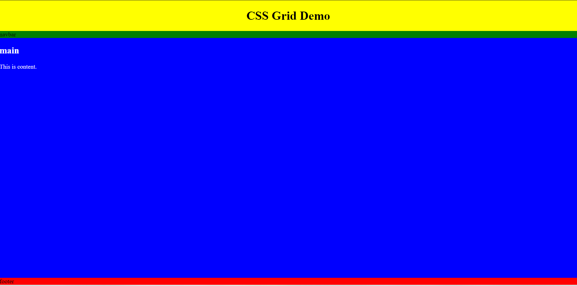
Full Screen with Footer at Bottom
This layout could easily be created using a position statement, but it's easier in Grid!
In the following CSS, four rows are defined; the heights are auto, auto, 1fr, and auto. The containing element (body) is set to a height of 100vh with no margins. The four areas, header, nav, main, and footer, have background colors simply to distinguish them from one another. Note the use of overflow in main; this allows the footer to remain visible even if the content is larger than the space available.
Note that this layout is responsive as is; media queries may be required for other details.
CSS
body {
    margin: 0;
    display: grid;
    grid-gap: 0px;
    grid-template-rows: auto  auto 1fr auto;
    border: thin solid black;
    height: 100vh;
}

header  {
    background-color: yellow;
    text-align: center;
}

nav {
    background-color: green;
}

main {
    background-color: blue;
    color: white;
    overflow: auto;
}

footer {
    background-color: red;
        }
HTML
<body>
    <header><h1>CSS Grid Demo</h1></header>

    <nav>navbar</nav>

    <main>
        <h2>main</h2>
        <p>This is content.</p>
        <br>
     </main>

    <footer>footer</footer>

</body>
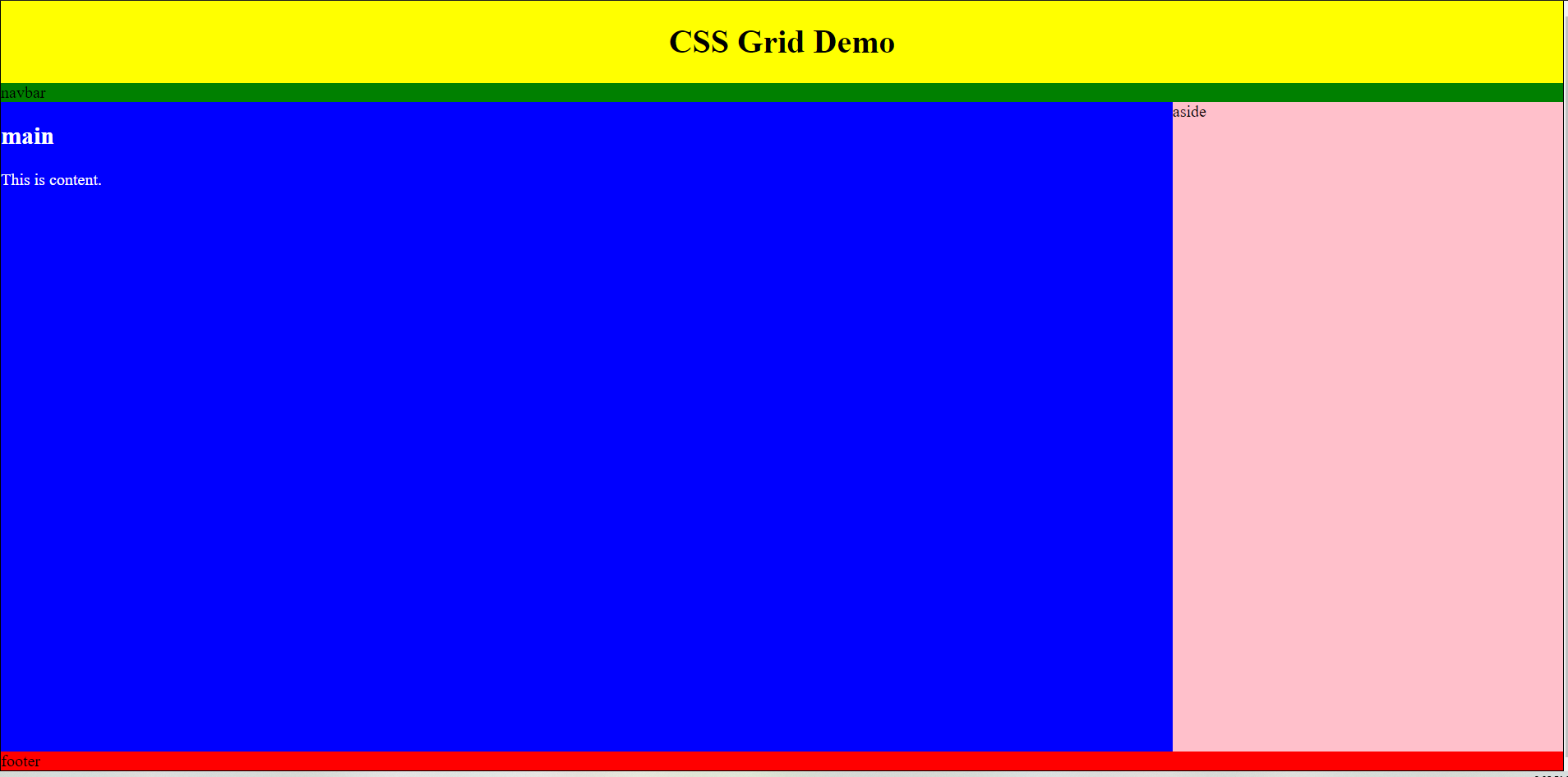
Full Screen with Two Columns and a Footer at Bottom (Modification of the Earlier Layout)
To create a second column in the content region, simply convert this to a two-column layout.
CSS
body {
    margin: 0;
    display: grid;
    grid-gap: 0px;
    grid-template-rows: auto  auto 1fr auto;
    grid-template-columns: 3fr 1fr;
    border: thin solid black;
    height: 100vh;
}

header  {
    grid-column: span 2;
    background-color: yellow;
    text-align: center;
}

nav {
    grid-column: span 2;
    background-color: green;
}

main {
    background-color: blue;
    color: white;
    overflow: auto;
}

aside {
    background-color: pink;
    grid-column: 2
}

footer {
    grid-column: span 2;
    background-color: red;
    }
HTML
<body>

<header><h1>CSS Grid Demo</h1></header>
<nav>navbar</nav>
<main>
    <h2>main</h2>
    <p>This is content.</p>
    <br>
</main>

<aside>aside</aside>

<footer>footer</footer>

</body>
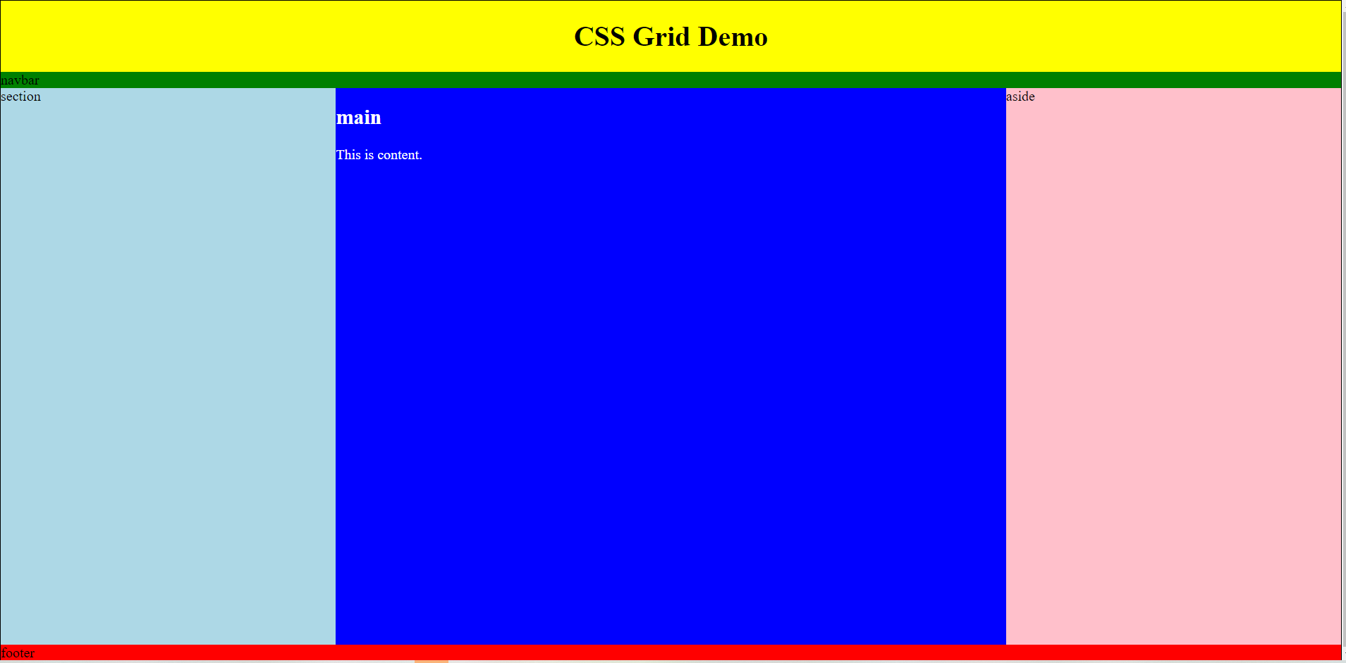
The "Holy Grail" Layout
Years ago, the "Holy Grail" layout was a three-column design with a header and footer. This is very simple to create with grid.
CSS
body {
    margin: 0;
    display: grid;
    grid-gap: 0px;
    grid-template-rows: auto  auto 1fr auto;
    grid-template-columns: 1fr 2fr 1fr;
    border: thin solid black;
    height: 100vh;
}

header  {
    grid-column: span 3;
    background-color: yellow;
    text-align: center;
}

nav {
    grid-column: span 3;
    background-color: green;
}

section {
    background-color: lightblue;
    grid-column: 1;
}

main {
    background-color: blue;
    color: white;
    overflow: auto;
    grid-column: 2;
}

aside {
    background-color: pink;
    grid-column: 3;
}

footer {
    grid-column: span 3;
    background-color: red;
}
HTML
<body>

<header><h1>CSS Grid Demo</h1></header>

<nav>navbar</nav>

<section>section</section>

<main>
    <h2>main</h2>
    <p>This is content.</p>
    <br>
</main>

<aside>aside</aside>

<footer>footer</footer>

</body>
Other Examples
There are multiple other examples all over the web.