
7. CSS Grid: Creating a Responsive Photo Album with Implicit Grid
Introducing Minmax and fr
11/21/2020
Responsive images are difficult, since images themselves are not responsive. They have fixed sizes and proportions, and those sizes and proportions may vary. Further some images use a portrait orientation while some use landscape.
These issues are only multiplied when creating a responsive photo album!
Creating a Photo Album
First, consider the requirements for a responsive photo album page. There will be a collection of images displayed in rows and columns. The size, proportion, and orientation of images will not be known in advance. The entire album should, of course, be responsive.
Second, consider the current options: CSS columns, Flexbox, and Grid. All have their advantages; however only Grid is intended to create two dimensional page layouts.
Steps
Image Considerations
A truly responsive photo album would also use responsive images! At a minimum, consider resizing your larger images into a more moderate size.
Determine the Desired Display Size for Images
Of course images could be displayed at full screen size; however, most photo albums display images in rows and columns. How large or small should the images be?
Determine The Number of Required Columns
Unfortunately this is impossible unless we know which device will be used!
Determine the Number of Required Rows
Again, we cannot determine this unless we know the viewport dimensions and image dimensions.
CSS Implicit Grid to the Rescue!
An implicit grid places items automatically!
Create the Grid
The number of columns is unknown; however, recall the basic CSS rule used to define columns: grid-template-columns: 200px 200px; This creates two columns of 200px width.
The repeat keyword is used to repeat a set of tracks as many times as needed. grid-template-columns: repeat(2, 200px) creates the same structure as the earlier example.
Again, the desired number of columns is unknown! Recall the auto-fit keyword. This instructs the browser to generate as many columns as will fit the content or given space. grid-template-columns: repeat(auto-fit, 200px); will create as many 200px columns as needed to fit the space and content.
However, what happens if the images are larger than 200px wide?
Minmax
CSS Grid includes the minmax keyword. This function essentially selects a minimum and maximum possible track width (or height); the track can change sizes within this given range.
FR
FR is a new unit of measurement; it represents a fraction of available space. In other words, fr has no inherit size; size is always relative. Let's say a container is set to width: 1000px. We could divide that into four equal parts, each one measuring 1fr. In that example, each fr would represent a quarter of the available space since there are four fr units. Had we divided our container into three units of 1fr each, then each fr would represent one third of the available space. We can even use fr in conjunction with other units of measure, such as pixels.
Revising The Grid
We do not know the viewport size or image sizes in advance; however we can establish the smallest viable size for an image within our album. For now, let's set the minimum acceptable width as 300px. Combining our minmax statement and fr units, the column statement becomes grid-template-columns: repeat(auto-fit, minmax(300px, 1fr));.
Break that down a bit. This CSS statement defines the columns within our grid. The auto-fit statement instructs the browser to create as many columns as required for the content, while the minmax statement sets a minimum width per column of 300px and a maximum width of 1fr -- in short, if extra space is available the columns can increase in size but must all be of equal size. The repeat statement simply repeats these columns as needed.
Neat: but what about the rows? Those are implicit: we don't need to declare them at all!
Dense
However, rather than accepting the default grid-auto-flow value, consider adding the keyword dense. This instructs the browser to move items from one row into another to fill empty spaces. grid-auto-flow: row dense;
Completing the Demo
Within the CSS for the container, center the grid content and items. Also consider setting a few CSS properties for the img statement and the figure statement.
CSS for the Containing Element .Album
.album {
    display: grid;
    grid-template-columns: repeat(auto-fit, minmax(300px, 1fr));
    grid-gap: 10px;
    justify-content: center;
    align-content: center;
    justify-items: center;
    justify-content: center;
    grid-auto-rows: auto;
    grid-auto-flow: row dense;
    background-color: whitesmoke;
}
CSS for Figure and Figcaption
figure {
    background-color: whitesmoke;
}

figcaption {
    text-align: center;
}
CSS for img
img {
    max-width: 100%;
    height: auto;
    object-fit: contain;
}
Notice object-fit: contain; This simply forces the image to fit within the containing element.
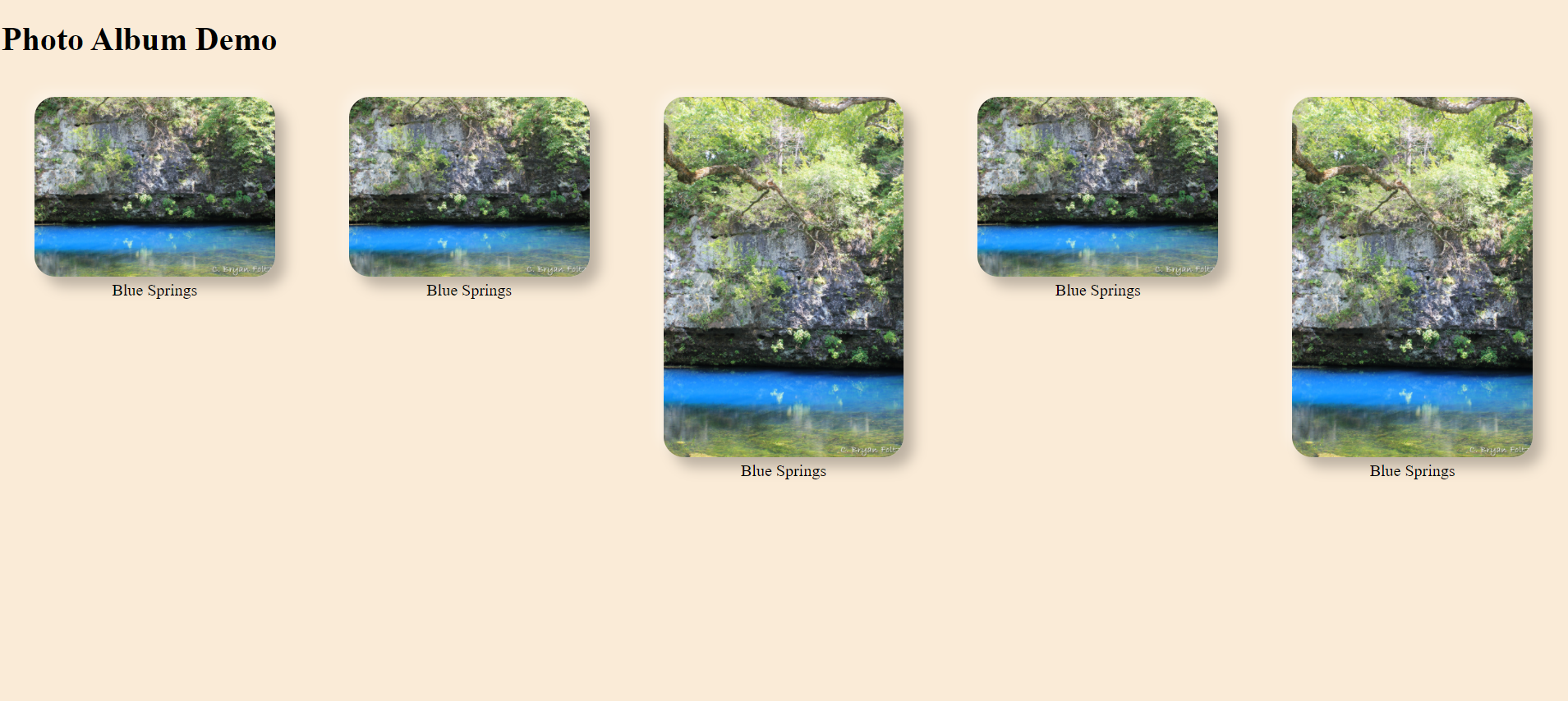
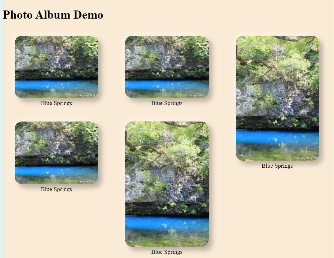
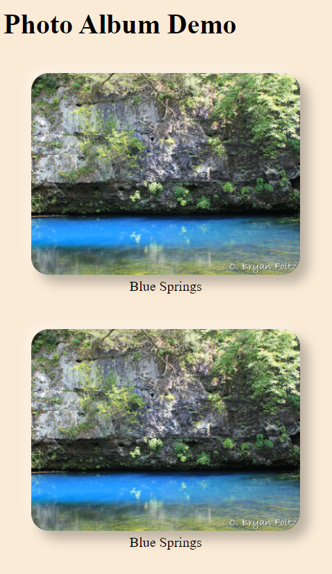
Results
The following images show the album created above, with a few minor tweaks to the appearance. The first image is full screen width, the second is reduced width, and the final image is a portrait view.
Note: The following images do have extra formatting for visual appeal.
Full Width
Tablet
Mobile
Why Are There Vertical Spaces?
A photo layout without the ugly vertical spaces is known as a masonry layout (or pintrest layout). This can be created using CSS columns; but the images will be placed (in sequence) vertically rather than horizontally. Since most people read left to right rather than up and down, that approach can be confusing. However, a new Grid specification to utilize masonry layout is on the horizon! (Alternatively such a layout can be created manually or with a little help from JavaScript.)