
CSS Grid: Implicit Grid with No Explicit Items
Repeat and Auto-fit
We can create a completely implicit grid! This can be a fantastic solution to some tricky issues!
For example, the designer may need to display a group of elements (perhaps images) of varying sizes; sometimes those sizes may not even be known in advance!
Implicit grid allows the designer to create a highly flexible grid that can also respond to changes in viewport size without media queries.
Example
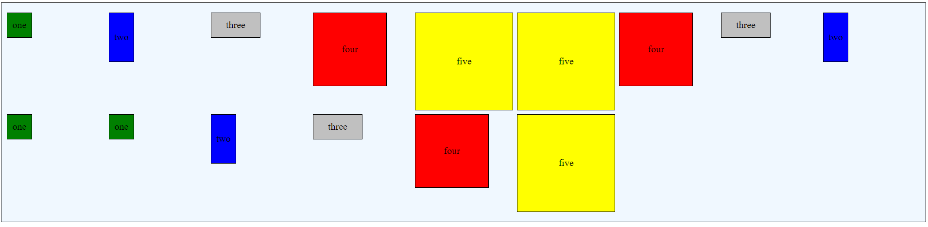
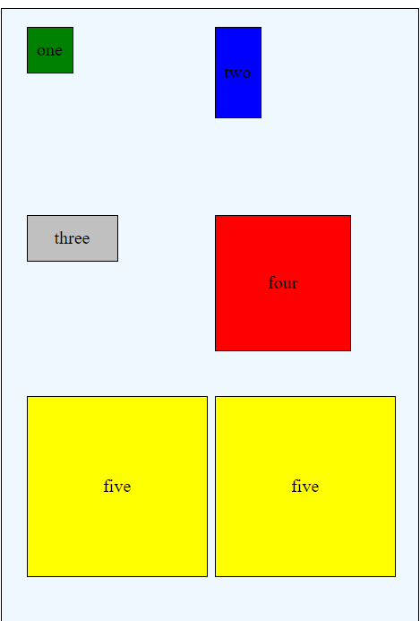
Consider the following HTML. This consists of 15 separate paragraph elements, each assigned to one of five classes. For convenience, the size of each class is specifically declared within the CSS; if these were images or other items, the size might not be known at all.
HTML
<div class="griddemo">

<p class="itemone">one</p>
<p class="itemtwo">two</p>
<p class="itemthree">three</p>
<p class="itemfour">four</p>
<p class="itemfive">five</p>

<p class="itemfive">five</p>
<p class="itemfour">four</p>
<p class="itemthree">three</p>
<p class="itemtwo">two</p>
<p class="itemone">one</p>

<p class="itemone">one</p>
<p class="itemtwo">two</p>
<p class="itemthree">three</p>
<p class="itemfour">four</p>
<p class="itemfive">five</p>

</div>
By using grid-auto-rows and grid-auto-columns in conjunction with grid-template-rows and grid-template-columns and the auto-fit and repeat keywords, the following CSS will define a grid which will create rows and columns as needed to accommodate the content and viewport. Notice that the track sizes are defined as 200px; that can be altered as well!
CSS
.griddemo {
    display: grid;
    grid-gap: 10px;
    grid-template-rows: repeat(auto-fit, 200px);
    grid-template-columns: repeat(auto-fit, 200px);
    background-color: aliceblue;
    border: thin solid black;
    justify-content: center;
    align-content: center;
    grid-auto-rows: repeat(auto-fit, 200px);
    grid-auto-columns: repeat(auto-fit, 200px);
    grid-auto-flow: row ;
}
Repeat
Repeat is an incredibly useful attribute! Rather than simply retyping every column or row specification, repeat allows for repeating patterns. For example, grid-template-rows: repeat(10, 200px); will create 10 rows of 200px each.
Auto-Fit
Auto-fit (and the related auto-fill) help specify the number of rows or columns created. Auto-fit adds as many rows or columns as will fit, but empty columns or rows are collapsed; auto-fill is very similar but does not collapse the empty tracks.
grid-auto-columns: repeat(auto-fit, 200px); creates as many 200px column tracks as will fit within the viewport.When the viewport changes dimensions, the number of columns will vary automatically.
Full-width viewport
Mobile Viewport (Reduced Width)