In an explicit grid, the designer specifies exactly where each item appears. What happens when extra items without such an explicit location are added?
The browser makes a guess and extends the grid. However, we can actually control what happens using a few extra statements.
Grid-Auto-Rows
In the containing element, simply add a grid-auto-rows to define any additional rows. For example, grid-auto-rows: 200px; will cause any implicit rows to be sized at 200px in height.
Grid-Auto-Columns
This property is essentially the same as grid-auto-rows: this controls the appearance of any additional columns. grid-auto-columns: 200px; will cause any extra implicit column tracks to be 200px wide.
Patterns
Both grid-auto-rows and grid-auto-columns support patterns. grid-auto-rows: 100px 200px; will cause implicit rows to alternate height; the first implicit track created will be 100px high, while the second will be 200px high and the third will be 100px high, etc.
Grid-Auto-Flow
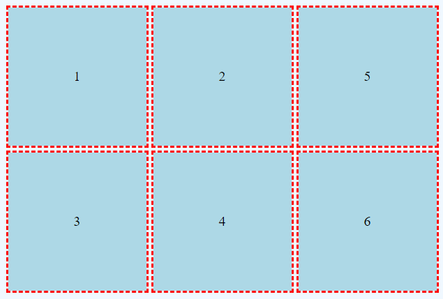
By default, a grid will create implicit rows. However that behavior can be altered; we can create implicit columns instead by using the grid-auto-flow property. This property should appear in the containing element.
grid-auto-flow: column;
Example
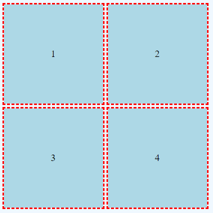
Consider a CSS Grid with two columns and two rows, with four explicitly placed items.

This grid could be created with the following HTML and CSS code.
HTML
<div class="griddemo">
    <div class="item1">1</div>
    <div class="item2">2</div>
    <div class="item3">3</div>
    <div class="item4">4</div>
</div>
CSS
.griddemo {
    display: grid;
    grid-gap: 10px;
    grid-template-rows: 200px 200px;
    grid-template-columns: 200px 200px;
    background-color: aliceblue;
    border: thin solid black;
    height: 100vh;
    justify-content: center;
    align-content: center;
    justify-items: center;
    align-items: center;
}

.item1 {

    grid-row-start: 1;
    grid-row-end: 2;
    grid-column-start: 1;
    grid-column-end: 2;
}

.item2 {
    grid-row-start: 1;
    grid-row-end: 2;
    grid-column-start: 2;
    grid-column-end: 3;
}

.item3 {
    grid-row-start: 2;
    grid-row-end: 3;
    grid-column-start: 1;
    grid-column-end: 2;
}

.item4 {
    grid-row-start: 2;
    grid-row-end: 3;
    grid-column-start: 2;
    grid-column-end: 3;
}


.item1, .item2, .item3, .item4, .item5, .item6 {
    outline: medium dashed red;
    background-color: lightblue;
    width: 100%;
    height: 100%;
    /* using flexbox to create vertical and horizontal centering */
    display: flex;
    align-items: center;
    justify-content: center;
}
Add Items Without Explicitly Stating Location
<div class="griddemo">
    <div class="item1">1</div>
    <div class="item2">2</div>
    <div class="item3">3</div>
    <div class="item4">4</div>
    <div class="item5">5</div>
    <div class="item6">6</div>
</div>
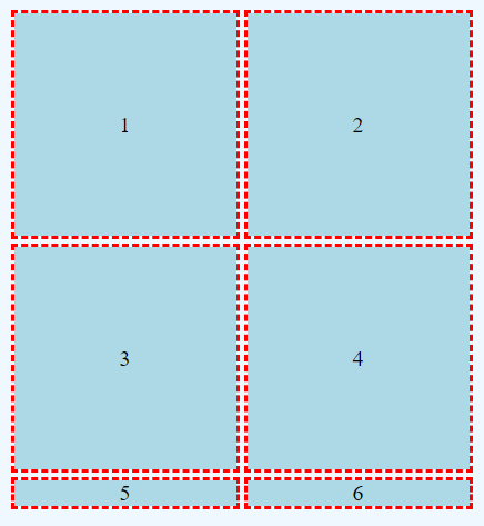
Notice there is no CSS for .item5 or .item6; however the basic formatting is provided in the final CSS rule.

This is probably not our desired result! The two new items have been added on a new row; however, the dimensions have not been applied. Note from the final CSS rule that all items are set to be 100% by 100%.
This happened because the browser essentially guessed. However, the designer can control how implicit tracks are created.
Grid-Auto-Rows and Grid-Auto-Columns
CSS
.griddemo {
    display: grid;
    grid-gap: 10px;
    grid-template-rows: 200px 200px;
    grid-template-columns: 200px 200px;
    background-color: aliceblue;
    border: thin solid black;
    height: 100vh;
    justify-content: center;
    align-content: center;
    justify-items: center;
    align-items: center;
    grid-auto-rows: 200px;
    grid-auto-columns: 200px;
}
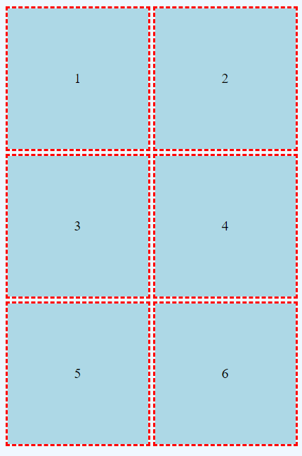
The final two properties, grid-auto-rows and grid-auto-columns, instruct the browser that all implicit rows and columns should measure 200px, which happens to be the same value used in the initial grid.

Grid-Auto-Flow
The grid-auto-flow property determines whether the browser adds implicit rows or columns. Rows are selected by default.
CSS
.griddemo {
    display: grid;
    grid-gap: 10px;
    grid-template-rows: 200px 200px;
    grid-template-columns: 200px 200px;
    background-color: aliceblue;
    border: thin solid black;
    height: 100vh;
    justify-content: center;
    align-content: center;
    justify-items: center;
    align-items: center;
    grid-auto-rows: 200px;
    grid-auto-columns: 200px;
    grid-auto-flow: column;
}
