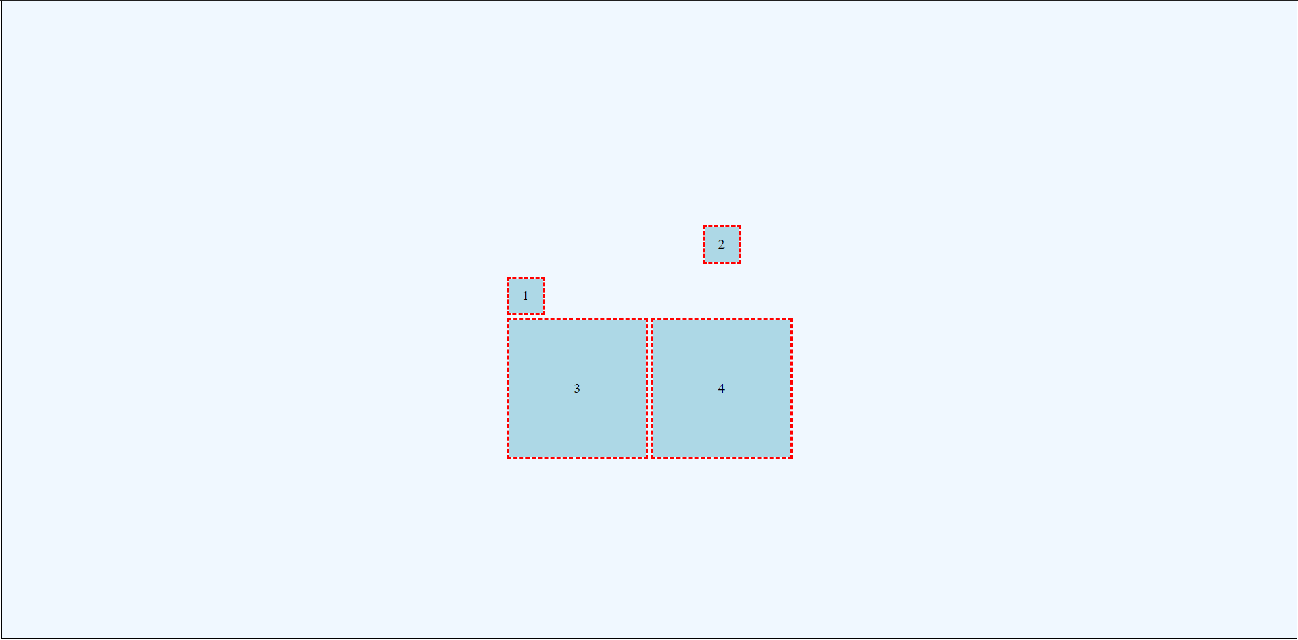
Within CSS Grid, there are (at least) two kinds of alignment and six alignment attributes. This can quickly become overwhelming!
Terminology Overview
There are six alignment attributes within CSS Grid. Understanding the various terms used within these attributes can be very helpful.
The Six Alignment Attributes
- justify-content
- align-content
- justify-items
- align-items
- justify-self
- align-self
Justify
Justify refers to altering positioning along the column (horizontal) axis.
Align
Align refers to altering positioning along the row (vertical) axis.
Content
Content refers to altering the position of the entire grid within the parent grid container itself. This is only applicable if the container is larger than the space required by all child elements combined.
Items
Items refers to altering the position of items within their assigned grid spaces. This is only applicable if the child items are the same size as their assigned grid locations.
Self
Self allows individual child items to have different justification and alignment than the whole set: this is essentially an override and is set on the specific child item rather than the containing element.
Two Types of Alignment/Justification
As suggested in the terms above, CSS Grid involves (at least) two different types of alignment. First, the developer can control where the grid appears within the grid container. Second, the developer can control where items appear within each grid area (recall that a grid area is defined as the intersection of two tracks: to borrow from Excel terminology, a grid area is basically a cell).
Using Alignment and Justification
Creating a Simple 2 by 2 Grid
The following discussion and examples will be based upon a simple 2x2 grid. Each row and column will be 200px in size. Also the grid area itself will have a defined height, and each of the child items will have defined sizes. These specifications allow us to see what happens as the various alignment and justification attributes are altered.
HTML
The following HTML will form the basis of our example. Notice there are five divisions. Grid of course does NOT depend on divisions: all we need is a containing element and child elements. For example an unordered list could become a grid, as could an article containing multiple sections.
<div class="griddemo">
    <div class="item1">1</div>
    <div class="item2">2</div>
    <div class="item3">3</div>
    <div class="item4">4</div>
</div>
CSS
The CSS below establishes our parent grid container. Notice this is a 2x2 grid: there are two columns and two rows. The columns are both 200px wide, and the rows are both 200px tall. That means each grid area will be a square 200px by 200px.
.griddemo {
    display: grid;
    grid-gap: 10px;
    grid-template-rows: 200px 200px;
    grid-template-columns: 200px 200px;
    background-color: aliceblue;
    border: thin solid black;
    height: 100vh;
}
The CSS below defines all four of our grid child items. Notice the use of full longhand specifications: this just makes reading the CSS easier. More importantly, please notice that the first two items are set to have widths and heights of 50px, while the last two items are set to have widths and heights of 100%. This difference will allow us to see the impact of various alignment and justification attributes.
The final CSS rule below simply provides an outline and background color for all of the child items.
.item1 {
    grid-row-start: 1;
    grid-row-end: 2;
    grid-column-start: 1;
    grid-column-end: 2;
    width: 50px;
    height: 50px;
}

.item2 {
    grid-row-start: 1;
    grid-row-end: 2;
    grid-column-start: 2;
    grid-column-end: 3;
    width: 50px;
    height: 50px;
}

.item3 {
    grid-row-start: 2;
    grid-row-end: 3;
    grid-column-start: 1;
    grid-column-end: 2;
    width: 100%;
    height: 100%;
}

.item4 {
    grid-row-start: 2;
    grid-row-end: 3;
    grid-column-start: 2;
    grid-column-end: 3;
    width: 100%;
    height: 100%;
}

.item1, .item2, .item3, .item4 {
    outline: medium dashed red;
    background-color: lightblue;
}
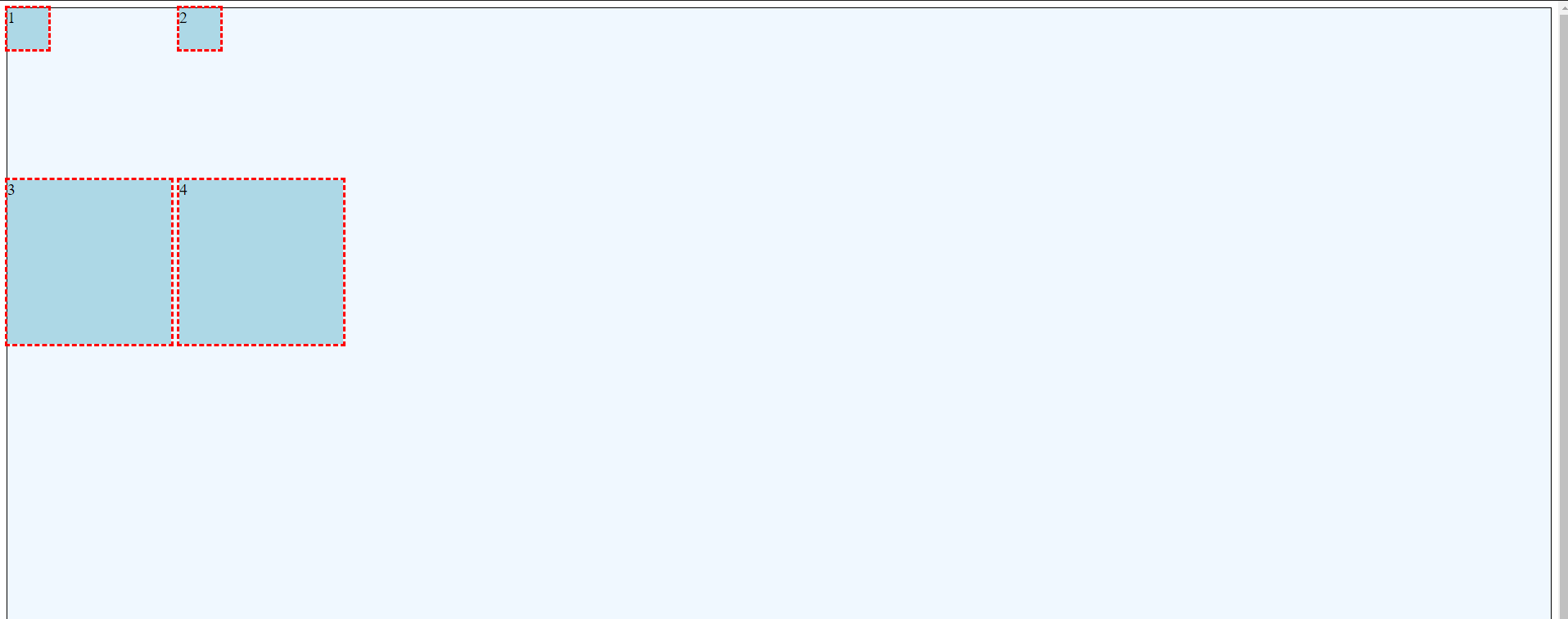
The grid defined above produces the following when rendered by Chrome.
Modify Placement of the Grid within the Containing Element using the justify-content and align-content Attributes
Justify-Content
The justify-content property is used to position the grid itself within the grid container. This only works when the container is larger than the grid. Justify-content aligns along the column (horizontal) axis.
Justify-content can use the following values:
- start
- end
- center
- stretch
- space-around
- space-between
- space-evenly
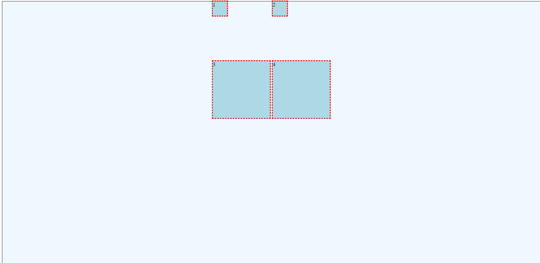
Consider the following CSS. The final line justify-content: center; causes the entire grid to be centered within the grid container.
.griddemo {
    display: grid;
    grid-gap: 10px;
    grid-template-rows: 200px 200px;
    grid-template-columns: 200px 200px;
    background-color: aliceblue;
    border: thin solid black;
    height: 100vh;
    justify-content: center;
}
Align-Content
The align-content property is used to position the grid itself within the grid container. This only works when the container is larger than the grid. Justify-content aligns along the row (vertical) axis.
Align-content can use the following values:
- start
- end
- center
- stretch
- space-around
- space-between
- space-evenly
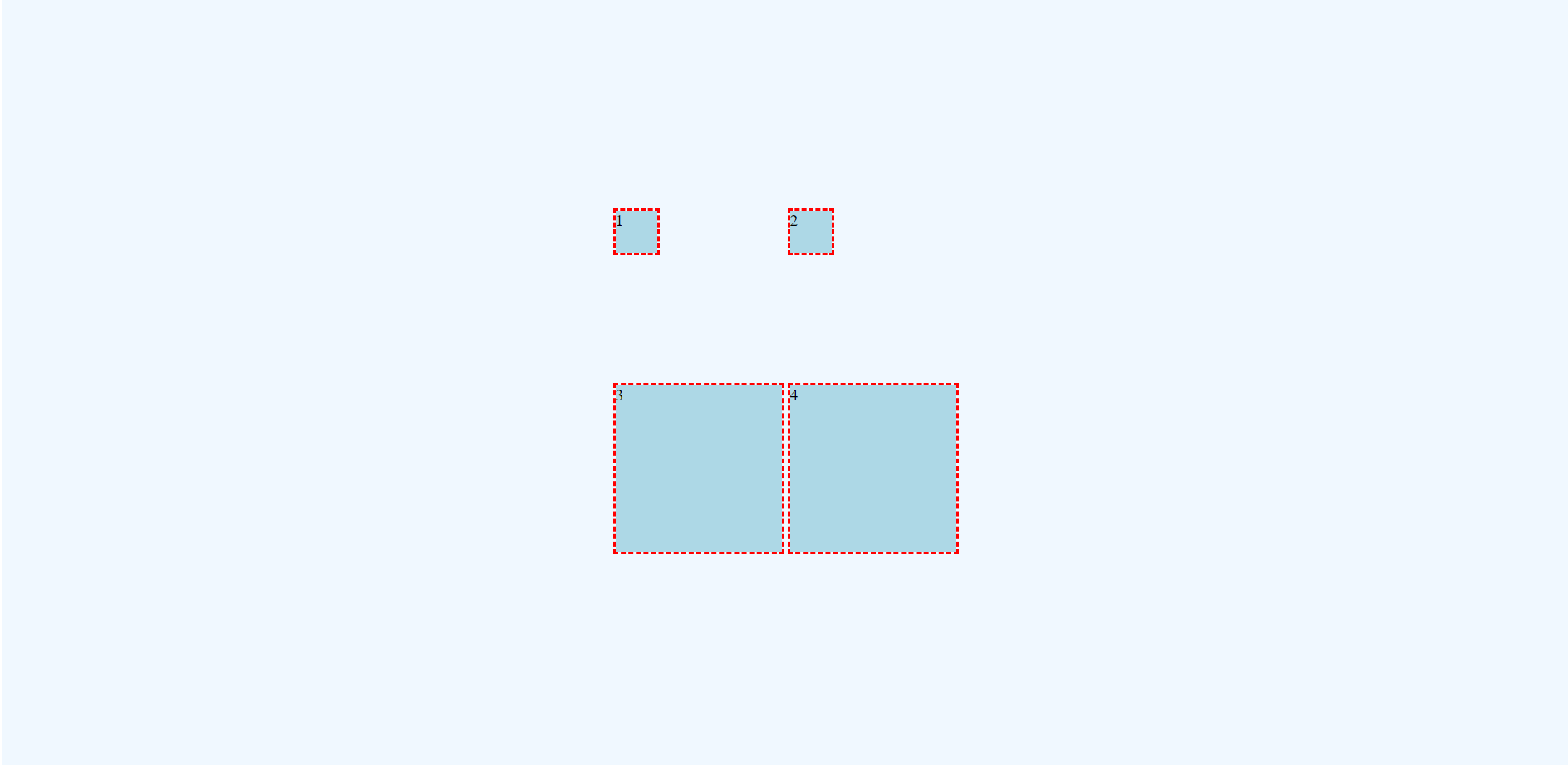
Consider the following CSS. The final line align-content: center; causes the entire grid to be centered vertically within the grid container.
.griddemo {
    display: grid;
    grid-gap: 10px;
    grid-template-rows: 200px 200px;
    grid-template-columns: 200px 200px;
    background-color: aliceblue;
    border: thin solid black;
    height: 100vh;
    justify-content: center;
    align-content: center;
}
Modify Placement of Items within the Grid Areas using the justify-items and align-items Attributes.
Justify-items
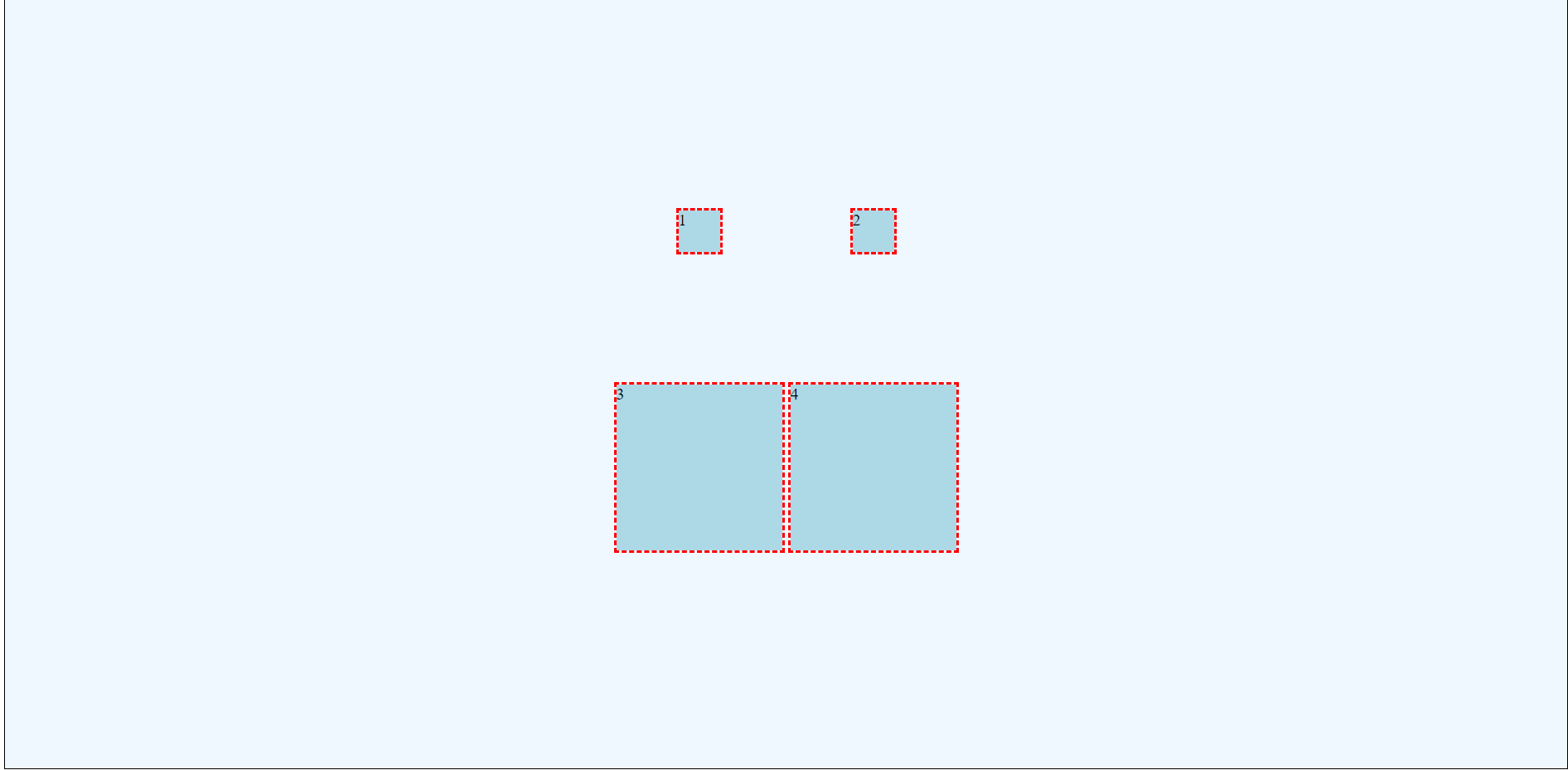
The justify-items property is used to position grid items within each grid area. This is only visible when the item is smaller than the grid area. Justify-items aligns along the column (horizontal) axis.
Justify-items can use the following values:
- start
- end
- center
- stretch (default)
Consider the following CSS. The final line justify-items: center; causes the grid items to be centered horizontally within their respective grid areas.
.griddemo {
    display: grid;
    grid-gap: 10px;
    grid-template-rows: 200px 200px;
    grid-template-columns: 200px 200px;
    background-color: aliceblue;
    border: thin solid black;
    height: 100vh;
    justify-content: center;
    align-content: center;
    justify-items: center;
}
Align-items
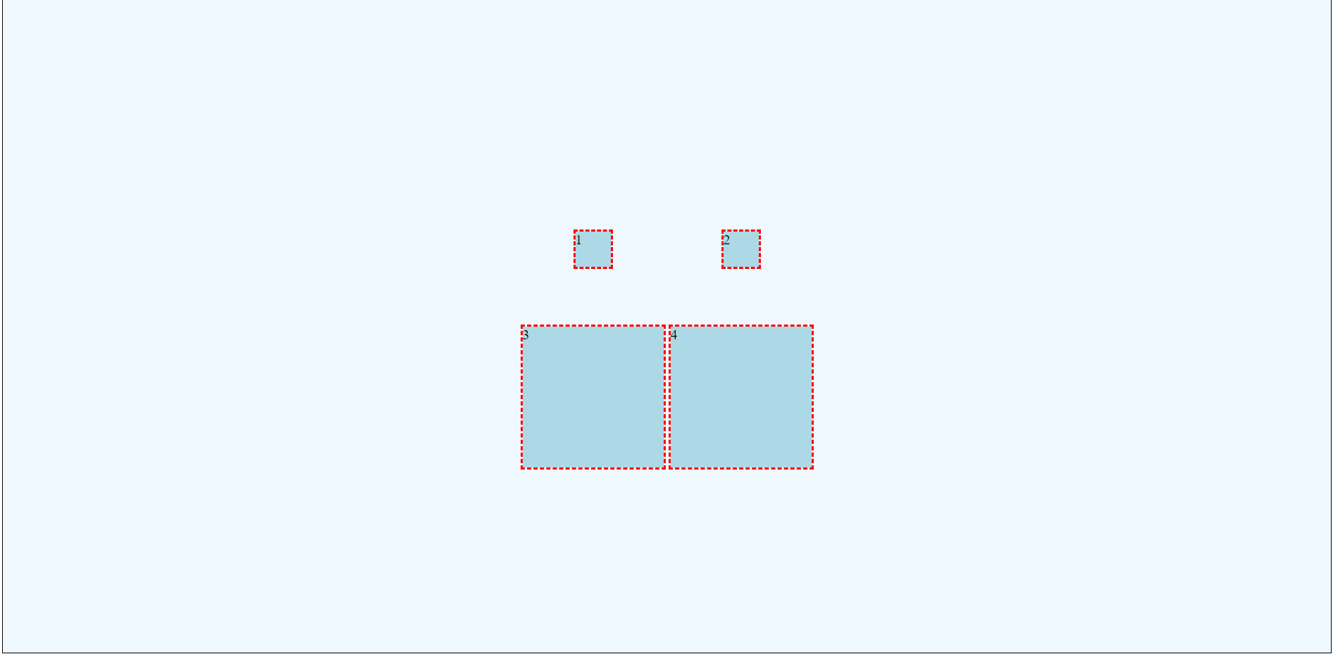
The align-items property is used to position grid items within each grid area. This is only visible when the item is smaller than the grid area. Justify-items aligns along the row (vertical) axis.
Align-items can use the following values:
- start
- end
- center
- stretch (default)
Consider the following CSS. The final line align-items: center; causes the grid items to be centered vertically within their respective grid areas.
.griddemo {
    display: grid;
    grid-gap: 10px;
    grid-template-rows: 200px 200px;
    grid-template-columns: 200px 200px;
    background-color: aliceblue;
    border: thin solid black;
    height: 100vh;
    justify-content: center;
    align-content: center;
    justify-items: center;
    align-items: center;
}
Modify the Placement of Specific Child Items within the Grid Area using the justify-self and align-self Attributes
Justify-self
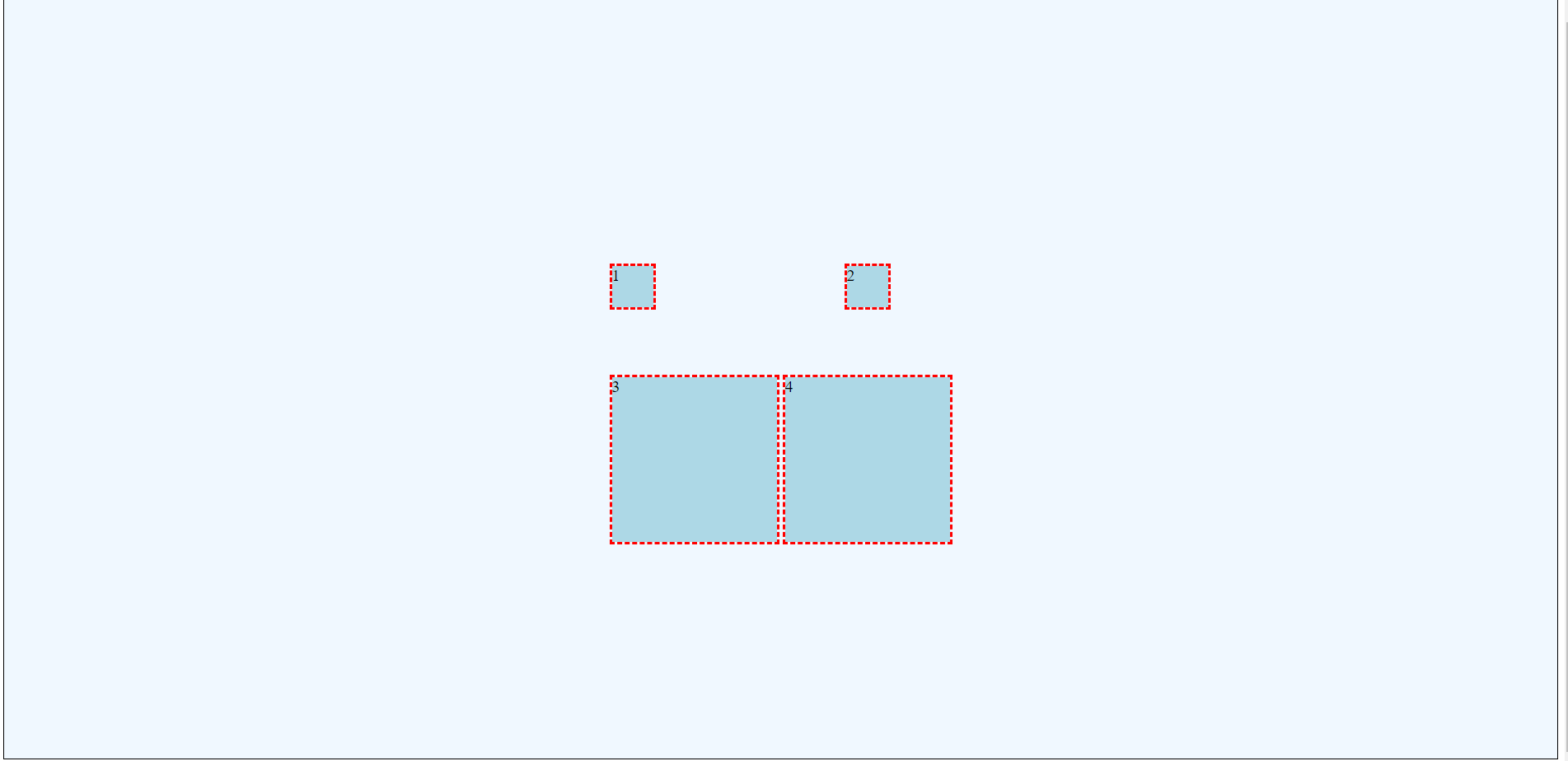
The justify-self property is used to override the justify-items setting on individual child items; this positions specific grid items within their respective grid areas. This is only visible when the item is smaller than the grid area. Justify-self aligns along the row (vertical) axis.
Justify-self can use the following values:
- start
- end
- center
- stretch (default)
Consider the following CSS. The final line justify-self: left; causes the grid items to be left aligned despite the earlier justify-items: center; option.
.item1 {
    grid-row-start: 1;
    grid-row-end: 2;
    grid-column-start: 1;
    grid-column-end: 2;
    width: 50px;
    height: 50px;
    justify-self: start;
}
Align-self
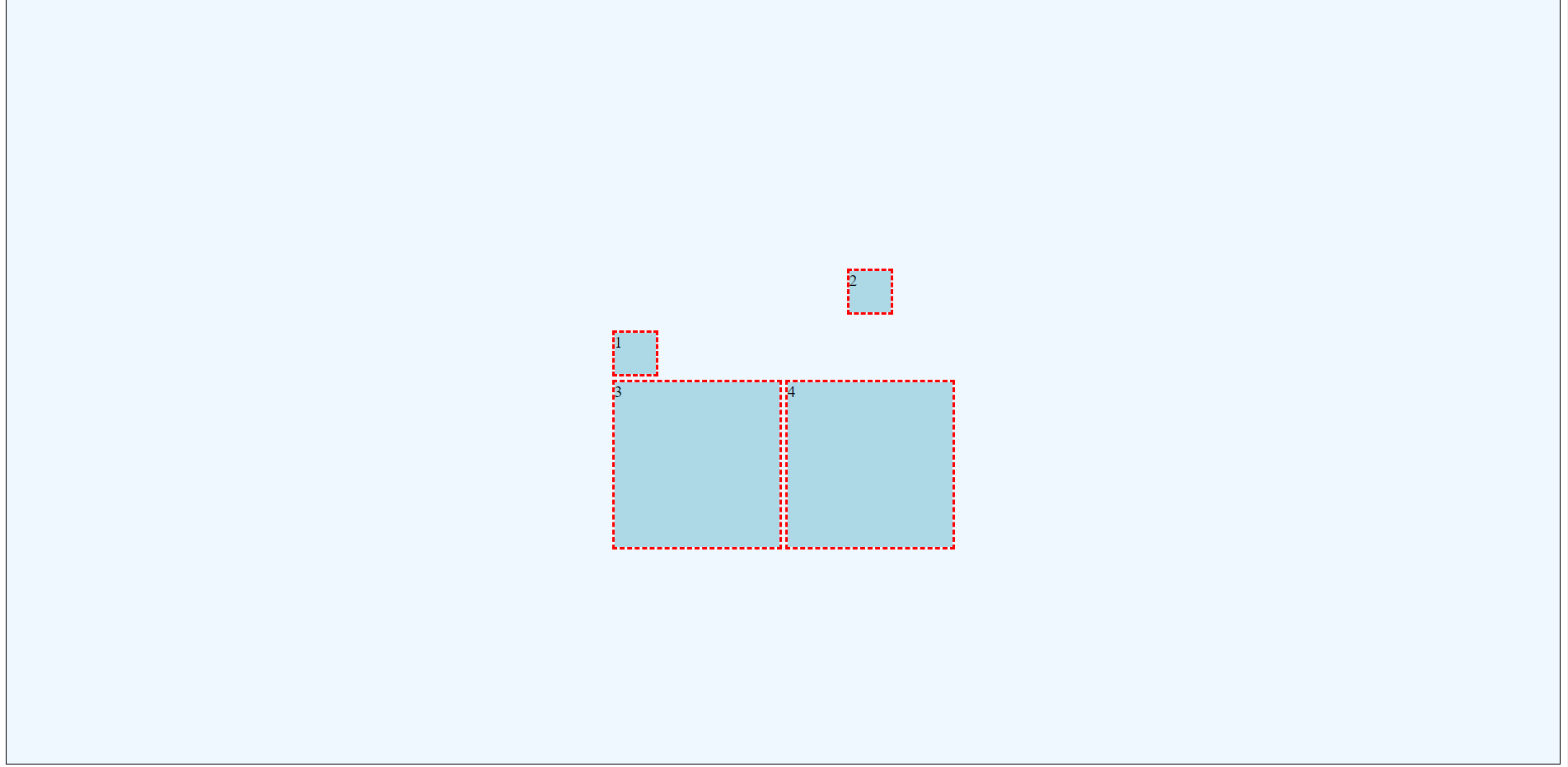
The align-self property is used to override the align-items setting on individual child items; this positions specific grid items within their respective grid areas. This is only visible when the item is smaller than the grid area. Align-self aligns along the column (horizontal) axis.
Align-self can use the following values:
- start
- end
- center
- stretch (default)
Consider the following CSS. The final line align-self: end; causes the grid items to be aligned at the bottom of the grid area despite the earlier align-items: center; option.
.item1 {
    grid-row-start: 1;
    grid-row-end: 2;
    grid-column-start: 1;
    grid-column-end: 2;
    width: 50px;
    height: 50px;
    justify-self: start;
    align-self: end;
}
Aligning Content Within Each Grid Item
Have you noticed that our content (the numbers 1, 2, 3, and 4) are still appearing in the top left corners? We have not addressed alignment or justification of content!
Content formatting follows the normal HTML/CSS rules. Horizontal alignment is fairly simple for text: just use text-align: center;. However, vertical alignment is quite different. There are a few approaches.
Use Inline Grid
Ben Frain suggests changing the grid container to display: inline-grid; and then adding display: grid; to each child element. With a few tweaks, this can create centered content. However, this is essentially placing a grid within a grid. The new specifications actually do include the idea of a subgrid. I would exercise caution with this approach as it may cease to function in the future.
Use Flexbox
Flexbox can exist within grid (and grid can exist within flexbox)!
One of the great benefits of flexbox is ease of centering content (both vertically and horizontally).
In the following CSS, the individual items have been converted to flexbox items and centered.
.item1, .item2, .item3, .item4 {
    outline: medium dashed red;
    background-color: lightblue;
    display: flex;
    align-items: center;
    justify-content: center;
}
