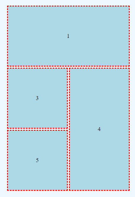
Grids are wonderful, but very few items fit perfectly within a single grid area.

Grid items are not constrained to fit within a single grid area!
Consider the image above. This grid consists of 3 row tracks and 2 column tracks; there are six grid areas. However, the area labeled 1 covers two separate grid areas, as does the area labeled 4.
.item1 {
    grid-row-start: 1;
    grid-row-end: 2;
    grid-column-start: 1;
    grid-column-end: 3;
    width: 100%;
    height: 100%;
}
In .item1, grid-column-start: 1; and grid-column-end: 3; provide a solution. .item1 is explicitly sized to cover two grid areas (side by side)!
(Please note that grid also supports a shorthand way of doing this; it's much easier!)
.item4 {
    grid-row-start: 2;
    grid-row-end: 4;
    grid-column-start: 2;
    grid-column-end: 3;
    width: 100%;
    height: 100%;
}
.item4 follows a similar pattern. grid-row-start: 2; and grid-row-end: 4; define an area that explicitly uses two grid areas, one above the other.