CSS Grid is a two-dimensional method of laying out website content. In many ways, CSS Grid is like a "responsive table", but there are so many more options within Grid!
While Grid offers an amazing number of options, there are multiple new commands and concepts to understand. The learning curve can be a little steep at first.
Basic Terminology
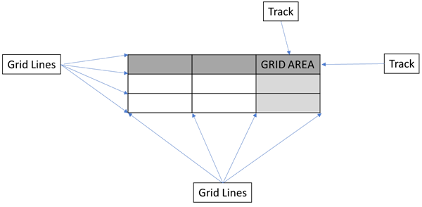
A CSS Grid consists of a containing element, grid items, grid lines, tracks, and grid areas.
Grid Containers and Grid Items
A Grid consists of a container (parent) and one or more items (children). This is the same concept as a list. An unordered list consists of an unordered list (<ul> & </ul>) containing a collection of list items (li). However, Grid is a formatting approach rather than a specific HTML element. For example, a Grid could consist of a set of nested <div> elements, or a list, or an <article> containing multiple <section> elements. In fact, the entire <body> could be a grid!
Grid Lines
Unlike an Excel spreadsheet or table in Word, the different areas within a Grid are identified by the grid lines. A track line is simply the vertical or horizontal lines making up the grid; except these are invisible! These are referenced by a line number or an optional name. The column grid lines (vertical lines) begin at the left with line 1, then line 2, etc. The column row lines (horizontal lines) begin at the top left with line 1, line 2, etc. Note that negative numbers may be used to move backwards, although I find that confusing!
Grid Tracks
In Excel or Word, we refer to columns and rows. In Grid, these are just tracks. They're the space between grid lines, whether vertical or horizontal.
Grid Areas
Grid areas are formed at the intersection of horizontal and vertical tracks. In Word or Excel we refer to these spaces as cells.

Explicit and Implicit Grids
Explicit Grids
Within an explicit grid, the items are placed by specifying locations exactly.
Implicit Grids
Implicit grids contain items that are placed automatically by the browser; the designer does not specify location.
Explicit and Implicit Grids Combined
These can indeed be combined!
Creating a Grid
Grids are created using both CSS and HTML. However the CSS is the more complex portion.
First, think about the content and desired appearance. Remember that a grid essentially looks like a table and that items will occupy one or more cells within the table; but the cells must still form rectangles.
Second, determine if possible the number of desired rows and columns for the layout. Note this may change in a responsive design (Media queries can be used to alter the structure.)
Third, determine if possible the number of grid items required for your specific content items.
Forth, build it!
Create the Grid Container
Within the CSS, create a parent container. This could be any element that contains other elements. For this example consider a class named griddemo.
Add the display: grid; item to indicate this is a grid. Note that grid is a block element; however, display: inline-grid; is also valid and will cause the containing element to display inline.
Specify the space between the tracks. The space between columns is defined by grid-column-gap: 5px; while the space between rows is defined by grid-row-gap: 5px;.
Specify the columns and rows. Sequence does not matter here: rows can be defined first or second. grid-template-rows: 200px 200px; defines two rows, each 200px tall. grid-template-columns: 200px 200px; defines two columns, each 200px wide. Notice that defining multiple rows or columns simply involves specifying more rows or columns.
This is a simple grid container!
.griddemo {
    display: grid;
    grid-column-gap: 5px;
    grid-row-gap: 5px;
    grid-template-rows: 200px 200px;
    grid-template-columns: 200px 200px;
}
Create and Place the Grid Items
This example consists of a grid container with two columns and two rows, with four explicitly placed items named .item1, .item2, .item3, and .item4.
Begin by creating a class named .item1 (for this example; class names are irrelevant in how grid actually works).
Specify where this item will begin within the grid structure. grid-row-start: 1; indicates this item will appear at the top of the grid. grid-row-end: 2; indicates the ending location. This item will occupy one row. grid-column-start: 1; and grid-column-end: 2; specify the horizontal location. In this case the item will occupy one column.
Notice we an extend an item across multiple grid areas simply by changing these references!
Continue to specify the location of the remaining items.
.item1 {
    grid-row-start: 1;
    grid-row-end: 2;
    grid-column-start: 1;
    grid-column-end: 2;
}

.item2 {
    grid-row-start: 1;
    grid-row-end: 2;
    grid-column-start: 2;
    grid-column-end: 3;
}

.item3 {
    grid-row-start: 2;
    grid-row-end: 3;
    grid-column-start: 1;
    grid-column-end: 2;
}

.item4 {
    grid-row-start: 2;
    grid-row-end: 3;
    grid-column-start: 2;
    grid-column-end: 3;
}
Add the HTML and Content
Again grids can be created with multiple HTML elements; div is used here for simplicity.
<div class="griddemo">
    <div class="item1">1</div>
    <div class="item2">2</div>
    <div class="item3">3</div>
    <div class="item4">4</div>
</div>
Done!
That's it! This is a very simple grid example.
Note: The image below utilizes some extra formatting to make the grid easier to view.
