
Flexible box, or flexbox, is a collection of CSS3 elements. Together, they define a flex container and flex elements (commonly referred to as a parent and children) which act as a sort of flexible table. Note that flexbox is intended to focus on a single row or column.
Usage
Flexbox is intended to support responsive design; however, this is a one-dimensional element: flexbox is really intended to support a single row or column. Flexbox is sometimes used as a true table (multiple rows / columns). CSS Grid (discussed later) should be used whenever you need a two-dimensional layout.
When using Flexbox, define either a row or column. That will be the container or parent. There are multiple attributes to define the container, such as direction, ability to wrap, and several types of alignment.
Next, define the flex elements or children. These are the specific items within the container. Again, there are a variety of attributes to consider.
The flexbox container and elements can be implemented as nested divisions, or as paragraphs or other elements. Ultimately the container and elements are just classes and can be assigned as such.
Considerations
Flexbox appears complicated, but is not really that bad. There are multiple attributes and various shorthand formats to consider.
Flexbox is not supported by all browsers. Most modern browsers do support it; however, you may need to use vendor prefixes. Please refer to the handout on vendor prefixes.
Flexbox Notes
There are four key characteristics: direction, alignment, ordering, and flexibility
Direction
We must decide if the flexbox is primarily horizontal (row) or vertical (column).
Alignment
Items can be aligned along the main axis and cross axis. Unfortunately the meaning of these terms varies based upon the direction of the flexbox.
Main Axis
This axis will be horizontal if the flexbox is defined as a row, but vertical if the flexbox is defined as a column.
Cross Axis
This axis will be vertical if the flexbox is defined as a row, but horizontal if the flexbox is defined as a column.
Ordering
Normally items will appear in the same order they appear in HTML. However we can override this if necessary.
Flexibility
We can define the flexibility of the flex-container.
Flexbox Properties for the Containing Element
Display
Purpose: defines a flex container.
Possible values: flex, inline-flex
Flex-direction
Purpose: defines the main axis.
Possible values: row, row-reverse, column, column-reverse
Flex-wrap
Purpose: Defines wrapping behavior.
Possible values: nowrap, wrap, wrap-reverse
Flex-flow
Purpose: Shorthand to combine flex-direction and flex-wrap
Justify-content
Purpose: defines alignment along the main axis.
Possible values: flex-start, flex-end, center, space-between, space-around
Align-items
Purpose: Defines default behavior for item layout along the cross axis.
Possible values: flex-start, flex-end, center, stretch, baseline
Align-content
Purpose: control alignment when there is extra space in the cross-axis.
Possible values: flex-start, flex-end, center, stretch, space-between, space-around
Note: this only applies if there are multiple occurrences of the main axis (for example, if the main axis is row, this only applies if there are multiple rows).
Flexbox Properties for the Child Elements
Order
Purpose: overrides the order in which items appear in the flex container.
Flex-grow
Purpose: defines the ability of a flex item to grow relative to other flex items.
Flex-shrink
Purpose: defines the ability of a flex item to shrink relative to other flex items.
Flex-basis
Purpose: defines default size of a flex-item before any remaining space is distributed.
Flex
Purpose: Shorthand for flex-grow, flex-shrink, and flex-basis.
Align-self
Purpose: overrides the flex-container alignment for a specific flex item.
Possible values: auto, flex-start, flex-end.
Examples
Example 1: A Beginning
Create a paragraph nested within a division.
Next, define display:flex for the containing element. (All remaining CSS just makes this easier to view).
HTML
<div class="container">
<p class="box">Try this</p>
CSS
.container {
    display: flex;
    background-color: yellow;
    border: thin solid black;
}

.box {
    background-color: aliceblue;
}
Results

Example 2: Specify the Direction
Modify the HTML to include two paragraphs.
Within the CSS, specify flex-direction: row
HTML
<div class="container">
    <p class="box">Box 1</p>
    <p class="box">Box 2</p>
</div>
CSS
.container {
    display: flex;
    flex-direction: row;
    background-color: yellow;
    border: thin solid black;
}
Results

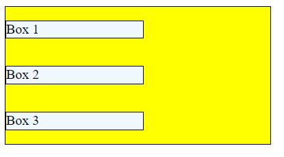
Example 3: Change the Direction
Alter the CSS to flex-direction: column;.
Results

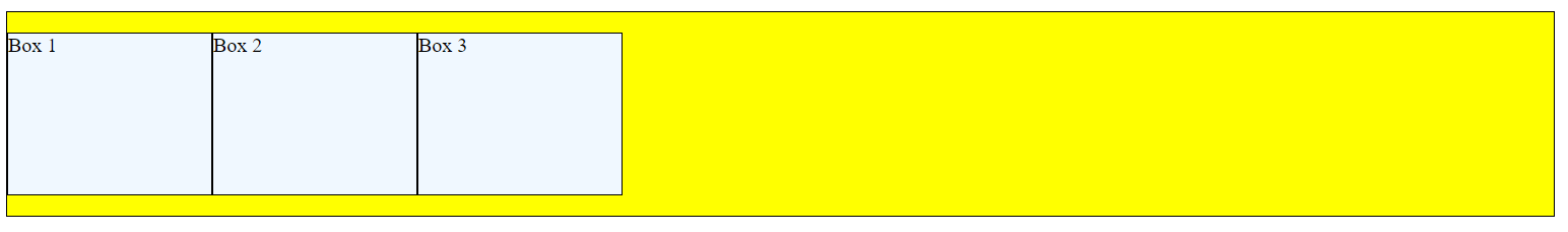
Example 4: Consider Flex-Wrap
Modify the HTML and CSS. In this example, an extra box has been added to the HTML. Within the CSS, the width of the containing element is set to 80% of the viewport, while the height is set to 200px. The box widths are set to 200px.
HTML
<div class="container">
    <p class="box">Box 1</p>
    <p class="box">Box 2</p>
    <p class="box">Box 3</p>
    </div>
CSS
.container {
    display: flex;
    flex-direction: row;
    flex-wrap: wrap;
    background-color: yellow;
    border: thin solid black;
    width: 80%;
    height: 200px;
}

.box {
    background-color: aliceblue;
    border: thin solid black;
    width: 200px;
}
Results: Notice how this wraps?
Full Viewport Width
About Half Viewport Width
Even Smaller Viewport Width
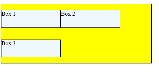
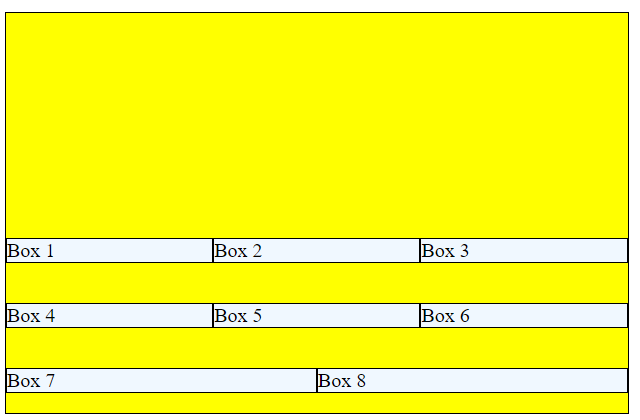
Example 5: Justify-Content
Justify-content defines alignment along the main axis. Recall that the main axis is horizontal when flex-direction is row.
Possible values include: flex-start, flex-end, center, space-between, and space-around.
Add justify-content: space-around; to the CSS. Also alter flex-wrap to nowrap.
Results

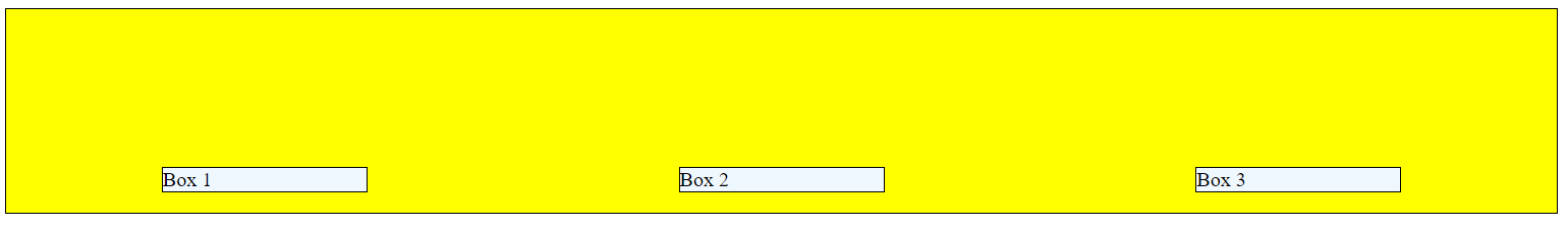
Example 6: Align-Items
Align-items defines alignment along the cross axis. Recall that thge cross axis is vertical when flex-direction is row.
Possible values include: flex-start, flex-end, center, stretch, and baseline.
Alter the CSS to include align-items: flex-end;
Results
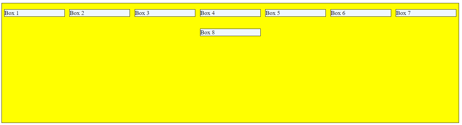
Example 7: Align-Content
Align-content controls alignment when there is extra space in the cross axis; this only applies if there are multiple rows.
In this example, multiple boxes have been added to the HTML. Also the CSS has been altered: the container height has been increased, and align-content: flex-start; has been added.
HTML
<div class="container">
    <p class="box">Box 1</p>
    <p class="box">Box 2</p>
    <p class="box">Box 3</p>
    <p class="box">Box 4</p>
    <p class="box">Box 5</p>
    <p class="box">Box 6</p>
    <p class="box">Box 7</p>
    <p class="box">Box 8</p>
</div>
CSS
.container {
    display: flex;
    flex-direction: row;
    flex-wrap: wrap;
    justify-content: space-around;
    align-items: flex-start;
    align-content: flex-start;
    background-color: yellow;
    border: thin solid black;
    width: 80%;
    height: 400px;
}
Results
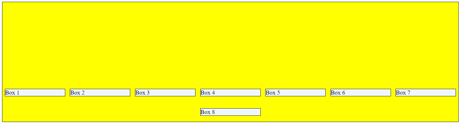
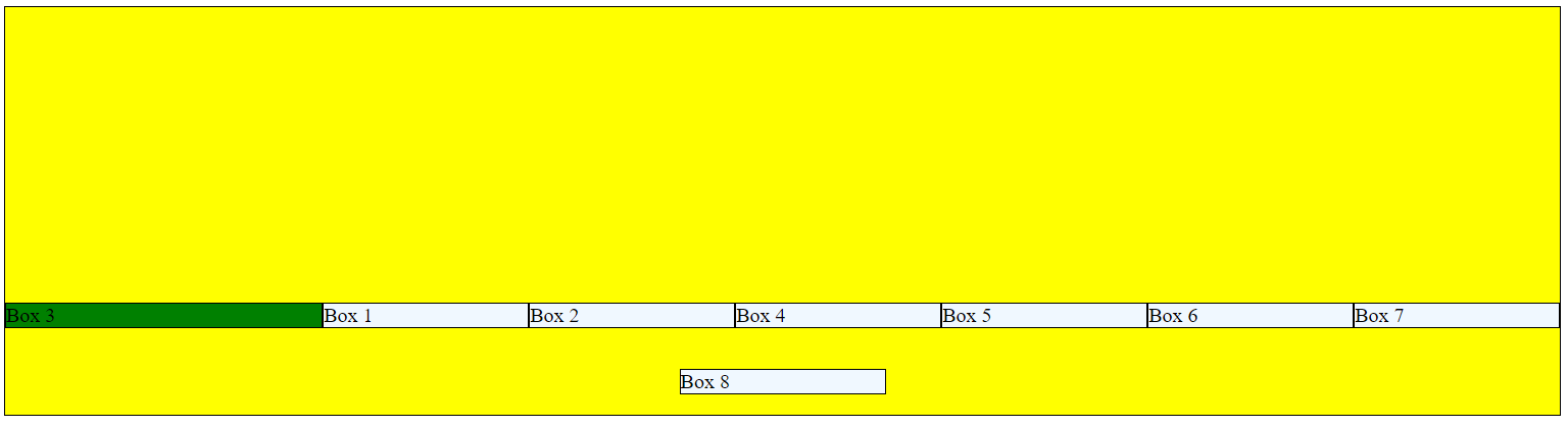
Example 8: Align-Content
Set align-content: flex-end;
Results
Example 9: Flex-Grow, Flex-Shrink, and Flex-Basis
These attributes work together; the flex property is a shorthand property for all three of these together.
Flex-grow and flex-shrink represent the degree to which an item is allowed to grow or shrink. The values are simply relative to one another. Flex-basis provides a beginning size.
Modify the CSS to specify flex-grow: 1; flex-shrink: 1; flex-basis: 200px;.
This allows the items to grown and shrink at equal rates. Since all items are defined with the same CSS, all items will have the same format.
.box {
    flex-grow: 1;
    flex-shrink: 1;
    flex-basis: 200px;
    background-color: aliceblue;
    border: thin solid black;
}
Results
Full Viewport Width

Partial Viewport Width
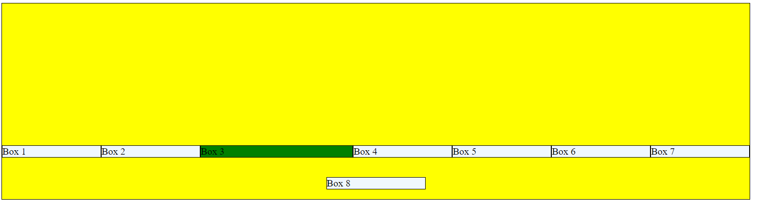
Example 10: Flex-Grow, Flex-Shrink, and Flex-Basis
Alter the CSS for .box as below (Essentially set the flex properties to the items cannot grow or shrink). Create a new CSS entry for .box2. Alter this slightly from the initial CSS for .box.
Notice how the .box2 grows and shrinks but the rest remain the same size.
CSS
.box {
    flex-grow: 0;
    flex-shrink: 0;
    flex-basis: 200px;
    background-color: aliceblue;
    border: thin solid black;
}

.box2 {
    flex-grow: 1;
    flex-shrink: 1;
    flex-basis: 200px;
    background-color: green;
    border: thin solid black;
}
HTML
Also apply .box2 to one of the paragraphs within the HTML <p class="box2">Box 3</p>
Results
Full Viewport Width
Partial Viewport Width

Example 11: Changing Order
The Order attribute can be used to alter display order. In the following example, order: 1; is applied to .box2, while order: 2; is applied to .box.
Results
Example 12: Perfect Centering with Flexbox
HTML
<div class="centeredbox">This is perfectly centered!</div>
CSS
.centeredbox {
    display: flex;
    justify-content: center;
    align-items: center;
    width: 300px;
    height: 300px;
    background-color: silver;
}
Results
