
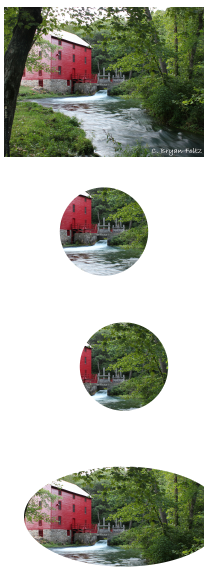
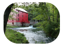
CSS Clip-Path allows us to remove (clip) an image. For example we could convert a rectangular image into a circle or star.
Approaches
- clip-path with url
- clip-path with circle
- clip-path with ellipse
- clip-path with inset
- clip-path with polygon
Clip-Path with URL
This relies upon SVG which we have not yet covered.
Clip-Path with Circle
This allows the designer to convert a rectangular image to a circle by removing excess content. The basic format is clip-path: circle(size location).
clip-path: circle(25%); creates a circle about 25% of size.
clip-path: circle(25% at 60% 40%); will create the same size result but centered at 60% horizontal and 40% vertical.
Clip-Path with Ellipse
This option creates an elliptical shape.
clip-path: ellipse(100px 50px at 60% 40%);
Clip-Path with Inset
This option requires four values which represent lengths to the inset from the edge. Generally these move clockwise, from the top, right, bottom, left. The round and length keywords are also valid and can be used to create rounded corners.
clip-path: inset(5px round 50px);
Clip-Path with Polygon
The polygon option allows the designer to create an incredible variety of shapes by specifying the corners. For example, clip-path: polygon(50% 0%, 0% 100%, 100% 100%); defines a triangle. The first point occurs on the top edge halfway in (horizontally 50%) and vertically at the top (0%). The second point occurs at the left edge and all the way down (0% 100%), and the final point occurs at the bottom right (100% 100%). The number of shapes possible is simply incredible!
Example
Consider the following: clip-path: polygon(50% 0%, 61% 35%, 98% 35%, 68% 57%, 79% 91%, 50% 70%, 21% 91%, 32% 57%, 2% 35%, 39% 35%);
What shape does that create?

Simple Way To Practice
Rather than creating these by hand, consider a tool like Clippy!